Text Element in Forms & Surveys
Want to make your form or survey more engaging and visually appealing? Adding a Text element is a simple way to guide users, highlight important details, or add a personal touch. Follow the steps below to easily customize and style your text exactly the way you want.
Using the Form Element
To add this element, open the builder for your selected form or survey and click Add Element. Within the Quick Add section, you will find the standard form/survey elements.
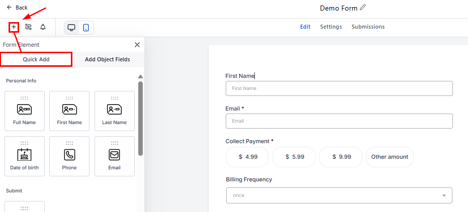
Drag and drop the Text element from the Customized Elements area onto your form or survey.
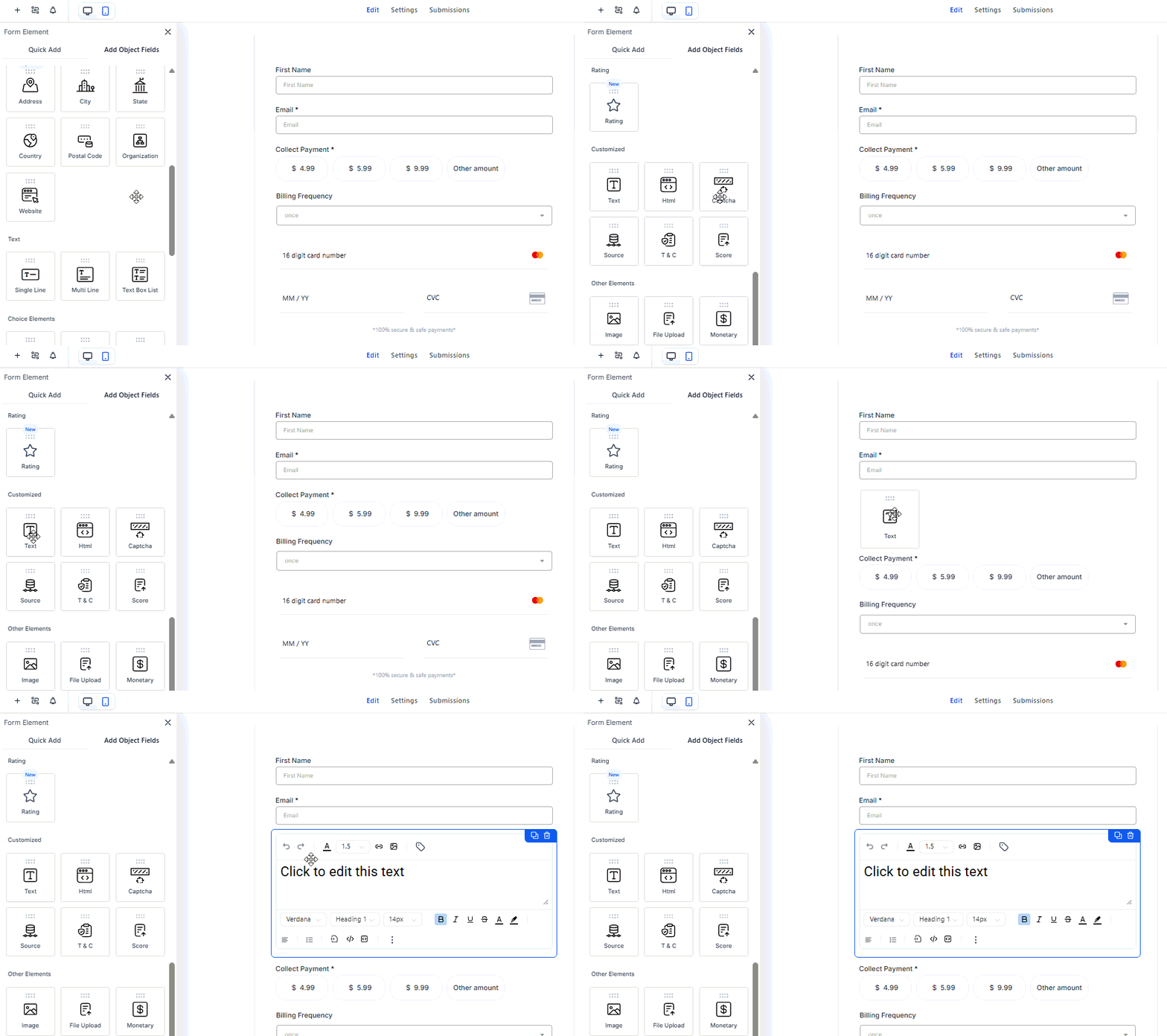
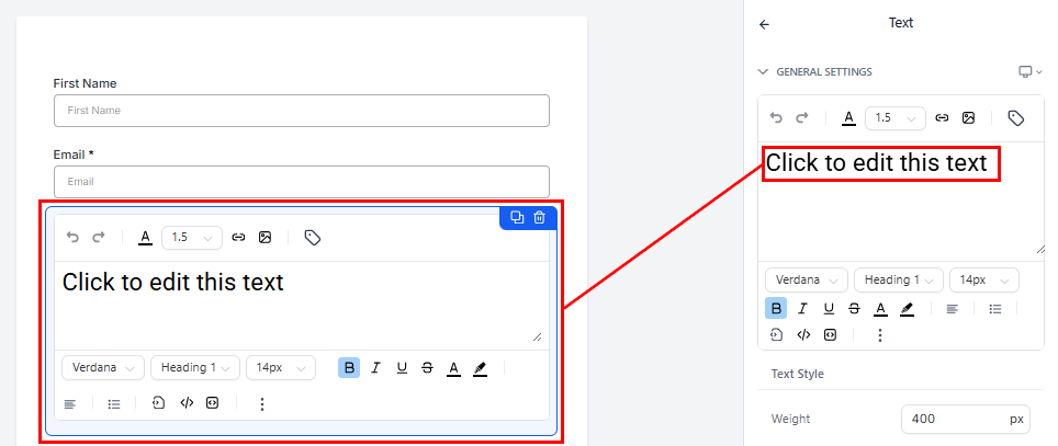
Next, edit the default text to reflect the message you want to convey.
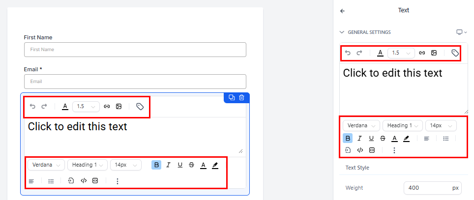
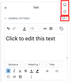
Use the inline text editor, from either the element settings panel or within the element itself, to enhance the visual appeal and functionality of your element. Some available options include adjusting the font type and size, as well as embedding a code or link within the text.
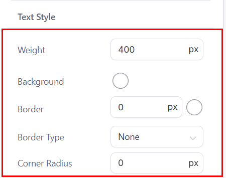
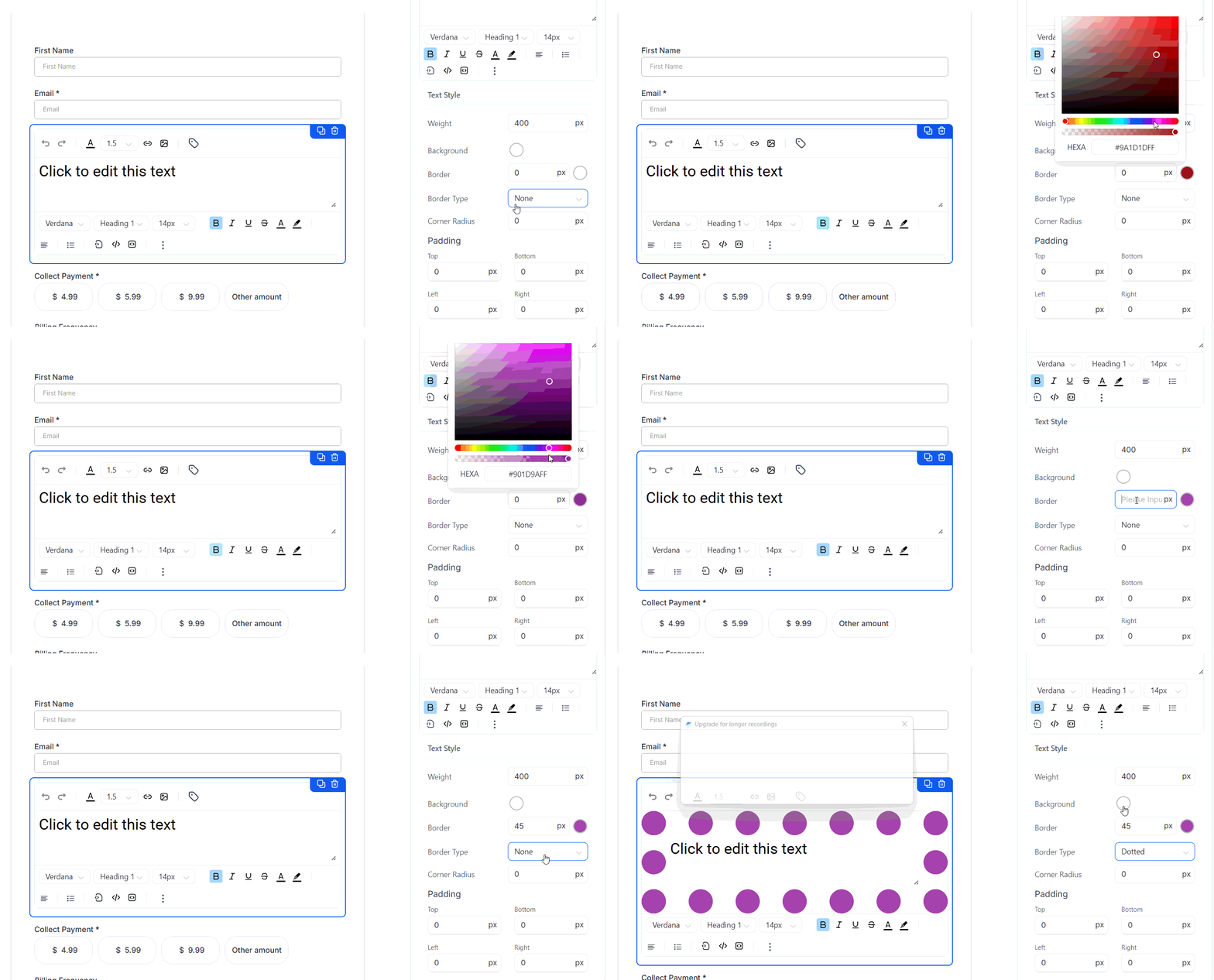
The Text Style area allows you to personalize the text even further. Here, you can adjust its weight and corner radius, apply a background and border color, and choose the border type.
Preview your changes in the builder as you go along.
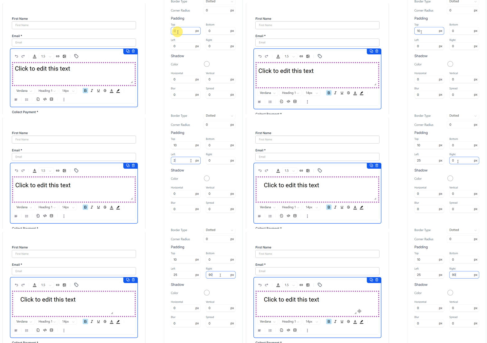
Scroll to the Padding area to adjust the placement of the text. Larger numbers will move the text further from the border.
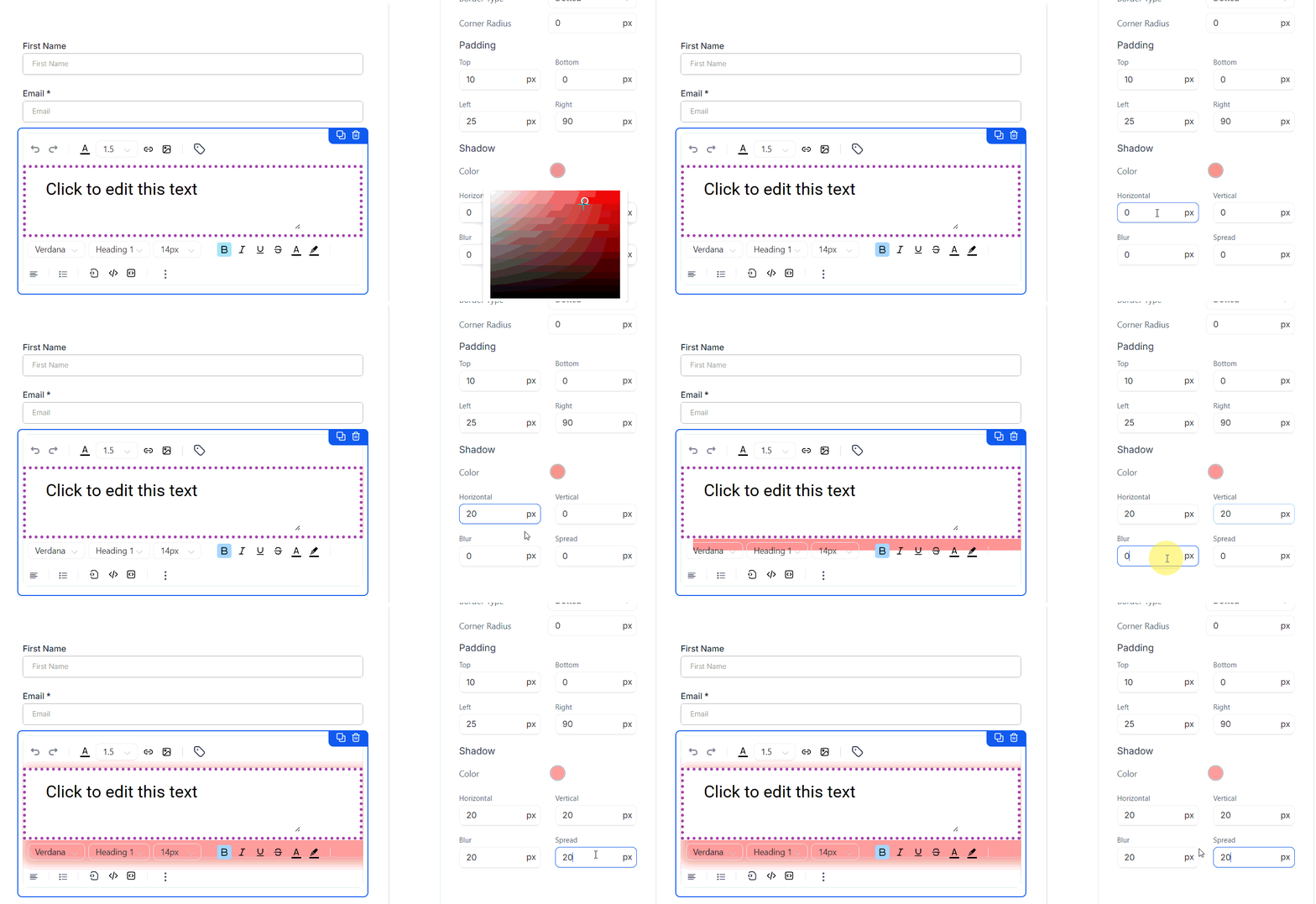
Lastly, choose a shadow color and adjust the shadow effects.
These settings can be applied uniquely for mobile and desktop views by choosing the device type from the General Settings device dropdown.
Once you’ve fine-tuned the styling, spacing, and shadow effects, take a moment to preview your work and see everything come together. With these customization options, your text won’t just share information—it’ll stand out and enhance the overall experience of your form or survey.
Not a Funnelbud customer yet?
Try our all-in-one CRM for sales and marketing — free for 7 days, no commitment.