Navigation Menu in Stores
The navigation menu element in stores will add a navigation menu to the top of your page. This is useful for linking to different sections of the page or linking to other pages in your store. When you add the navigation menu element, you will have editing options in its settings on the right. This article will explore each setting so you can properly configure this element.
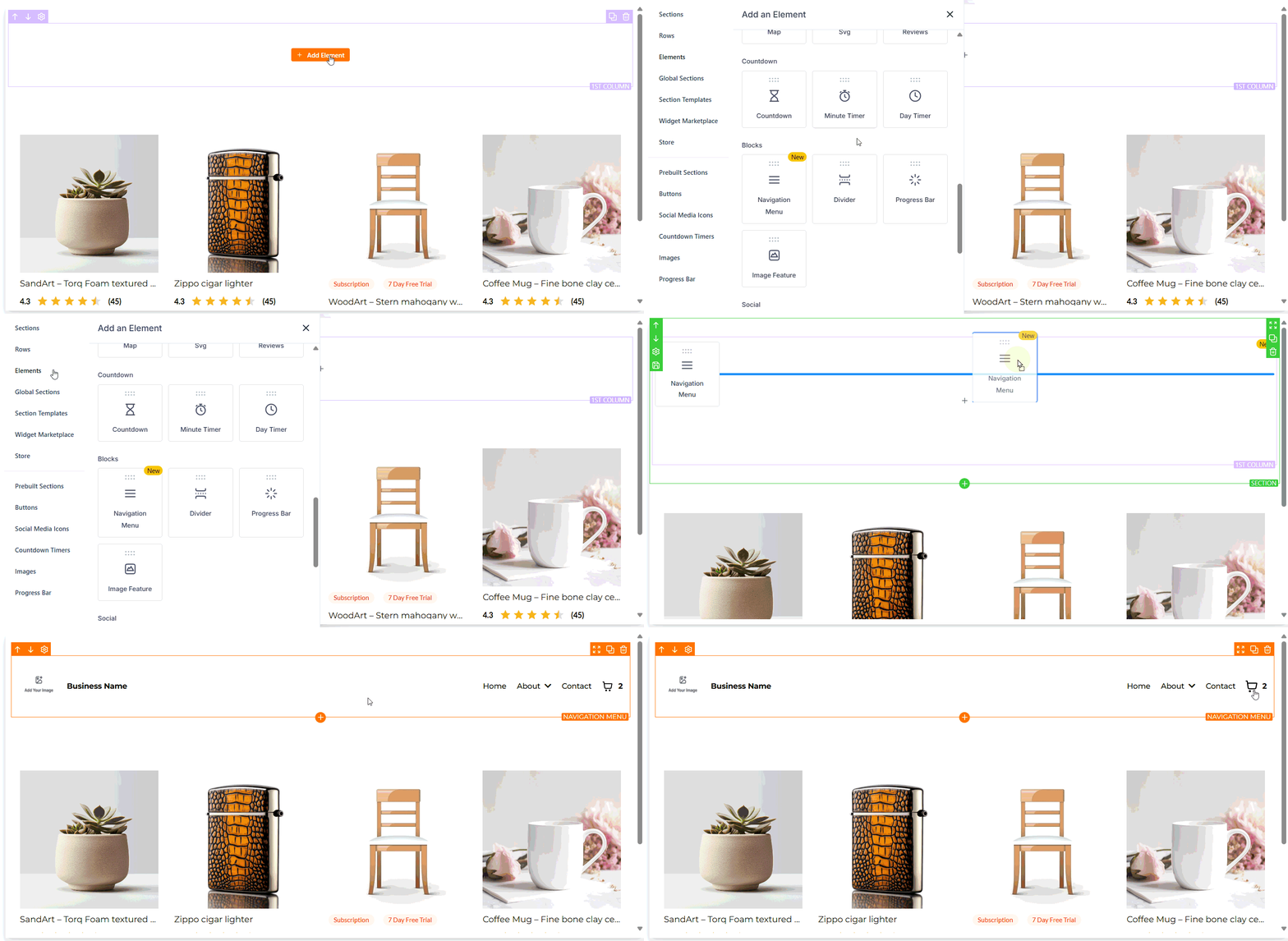
Let’s begin by adding the element.
General Settings
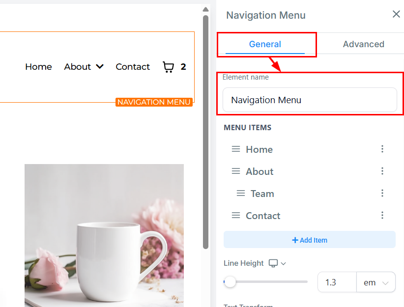
Element Name
In the General Settings section, you will find the default name of the element. You can keep it as is or rename it to something more descriptive. Renaming the element is highly recommended as it will help you identify it easily later when you review the elements in your list.
Menu Items
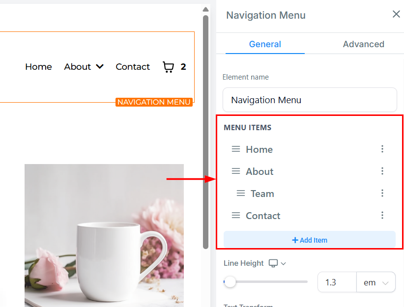
The Menu Items feature enables you to include essential navigational options such as Home, About, Team, and Contact Menus on your website’s navigation bar. You can add more options by clicking on the ”+ Add Item” button.
Line Height
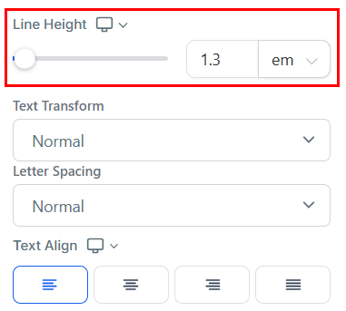
With the Line Height feature, you can increase the vertical spacing between text lines by either adjusting the size bar or typing a number in the designated field. This customization allows for improved readability and aesthetics of your content.
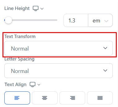
Text Transform
Using the Text Transform feature, you can change the text format to Uppercase, Lowercase, or capitalize each word. This customization allows you to modify the text style for enhanced visual appeal and readability.
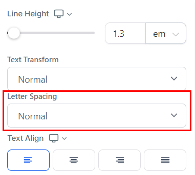
Letter Spacing
The Letter Spacing feature allows you to adjust the space between each letter in your text.
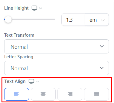
Text Align
Using the Text Align feature, you can adjust the positioning of your text to your liking. You have the option to position it to the left, center, right, or as justified.
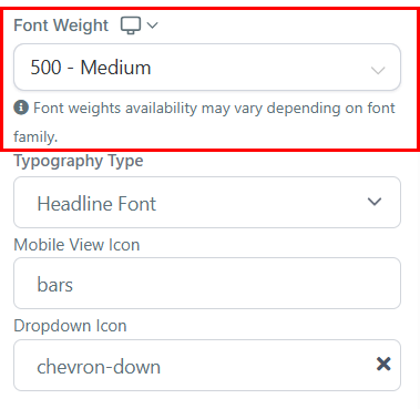
Font Weight
For both Desktop and Mobile Views, you can adjust the thickness of your text using the Font Weight feature.
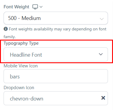
Typography Type
The Typography Type dropdown will give you options for the font of your navigation bar. You can choose to use the headline or content font that you set up in settings or choose a custom font. With the custom font option, you will then be able to select from a variety of fonts with an additional dropdown.
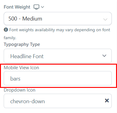
Mobile View Icon
You can add an icon to your page by simply selecting from the available icon. If you have the desired icon in mind, you can type it into the search bar to narrow down the options.
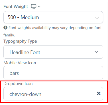
Dropdown Icon
Add a dropdown icon to your menu by selecting from the available options in the style editor. The icon will indicate when an item can expand, and it includes a smooth rotation animation.
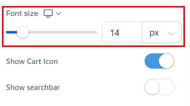
Font Size
Adjust the font size of a particular text/content for both mobile and desktop devices easily by dragging the size bars. This feature enables you to customize the visual appearance of your content for optimal user experience. You can preview the mobile font size to ensure it is formatted correctly by toggling the mobile view in the top menu bar of the builder.
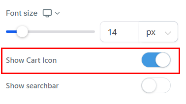
Show Cart Icon
Enable the Show Cart Icon option to display the shopping cart in the navigation menu, providing users with a clear view of the number of items in their cart before proceeding to checkout.
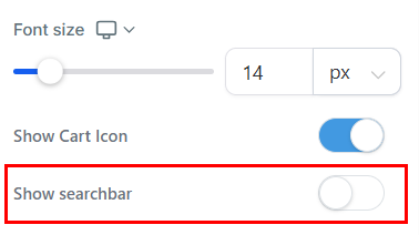
Show Searchbar
Enable the Show Searchbar option to display a search menu within the navigation window to seamlessly locate product offerings.
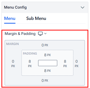
Spacing Option
The Spacing Option feature offers a variety of spacing options to adjust the content in the menu and sub-menu of your element.
- Padding Left, Right, Top, and Bottom: The Padding Left, Right, Top, and Bottom options include four toggle bars that allow you to move your content to the left, right, top, or bottom, depending on which toggle bar you click on. You can adjust the spacing by dragging the toggle bar to increase or decrease the space you want.
- Margin Top and Bottom: By toggling the bars available for Margin Top and Bottom, you can adjust the top or bottom margin of your content. Drag the toggle bar to increase or decrease the size of your margin. This will add negative space to the top or bottom of your element, depending on which margin you toggle.
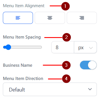
- Menu Item Alignment: This feature helps you control the layout of the items to ensure your navigation menu is both visually appealing and functional.
- Menu Item Spacing: In the Menu Item Spacing Options, you can adjust the spacing of your menu items. To do this, simply move the bar to increase the number until you achieve the desired spacing. You can also input a desired number into the box to ensure your element is spaced accordingly.
- Business Name: Toggle on this feature to add a business name to the menu.
- Menu Item Direction: Menu Item Direction allows you to choose between displaying your navigation bar in the default or reverse order.
Color Options
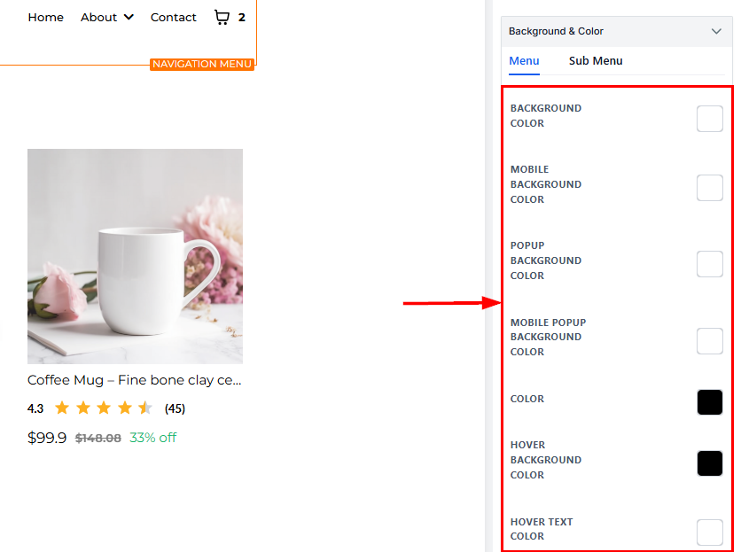
The Color Options feature enables you to adjust various text and icon colors to suit your preferences.
- Background Color: Allows you to change the background color of your navigation bar or section for desktop view. You can select a color from the palette.
- Mobile Background Color: Customizes the background color for your navigation menu specifically in mobile view, ensuring a cohesive design across devices.
- Popup Background Color: Adjust the background color of any popups linked to your navigation menu, such as dropdown menus.
- Mobile Popup Background Color: This lets you set the background color for popups displayed in mobile view, improving readability and style.
- Color: Controls the text color when it is in its default (non-bold, non-italicized) form. You can select any shade to match your branding.
- Hover Background Color: You can change the background color of the Hover here. This works only on the Desktop view.
- Hover Text Color: You can change the color of your Hover here.
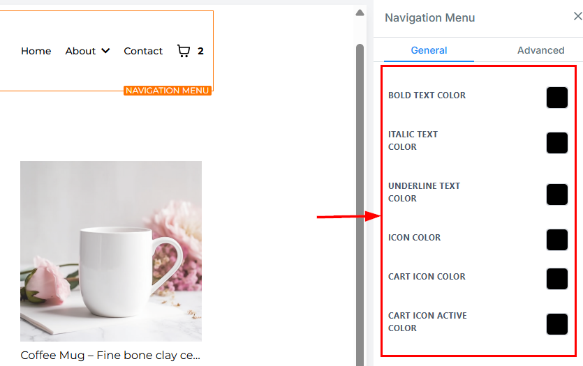
- Bold Text Color: When a text is in bold form, you can change the color here. To make a bold text, highlight the text and then click on the “B” icon.
- Italic Text Color: You can only edit an italic text color here. To make an italic text, highlight the text and then click on the Slant “I” icon.
- Underline Text Color: You can only edit an underlined text color here. To underline your text, highlight the text and then click on the underlined “U” icon.
- Icon Color: If you have an icon added to this page, you can only edit the icon color here. Only the icon color will change, regardless of the position it’s placed.
- Cart Icon Color: Defines the default color of the cart icon displayed in the navigation menu. This color will be visible when the icon is unselected.
- Cart Icon Active Color: Specifies the color of the cart icon when it is selected, providing a visual cue to indicate user interaction or activity.
Brand Logo Config
- By toggling on the “Logo in Menu” button, you can place your brand logo on the left corner of your navigation menu, enabling easier accessibility to your website. When you toggle on the button, editing options become available.
- Brand Logo: You can add your brand logo to the menu by clicking on the image icon located on the right side of the designated space. It will lead you to the import page, where you can upload your logo image. Afterward, click on the clipboard icon at the upper right corner of the page to copy the image URL. You can exit the import page and paste the URL into the Brand logo space provided.
- Optimize Image load: Ensure that your logo image is optimized for fast loading by compressing it to an appropriate size before uploading. This helps to enhance page speed and overall user experience.
- Width and Height: In this Width and Height section, you can adjust the width and height of your brand logo to the desired size to fit your menu. You may need to play around with different combinations of numbers to get the right fit.
- Alt Text (for SEO): Take advantage of the Alt Text feature to input SEO keywords relevant to your brand in the navigation bar section. It will enable your brand to show up in relevant search queries on search engines.
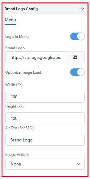
Image Actions
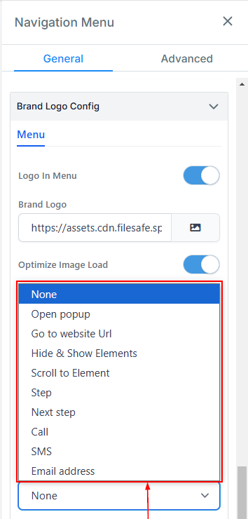
In the Actions feature, you have a variety of options to select from.
- Open pop-up: This action allows you to display a pop-up when the image is clicked. You can customize the pop-up content and design based on your requirements.
- Go to Website URL: Upon selecting “Go to website URL” in the “Image Action” icon, you will be required to indicate which website page you want to direct your visitors.
- Hide & Show Elements: Use this action to toggle the visibility of specific elements on the page. You can set the image to either hide or reveal selected elements upon interaction.
- Scroll to Element: Selecting this action allows you to create a smooth scrolling effect that directs visitors to a specific section of the page when the image is clicked.
- Step: Use this action to move to a specific step in your store when the image is clicked. This is particularly useful for multi-step stores.
- Next Step: This option automatically advances visitors to the next step in your store upon clicking the image.
- Call: Set the image to initiate a phone call to a pre-defined number when clicked. This action is ideal for encouraging direct communication with your audience.
- SMS: Use this action to compose and send a text message to a pre-specified number when the image is clicked.
- Email address: Configure the image to open the user’s default email client with a pre-filled recipient email address, subject, or body content, making it easy for visitors to contact you.”
Customer Login
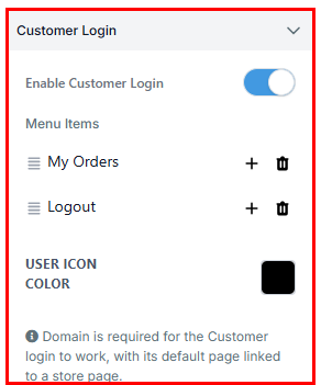
Enable the Customer Login feature to allow visitors to log in directly from the storefront to view order history and account-specific content without redirection. This seamless, secure login adds professionalism, boosts user trust, and supports repeat purchases through an integrated dropdown menu and customizable navigation options.
Advanced Settings
Under Advanced Settings, you will have additional customization options.
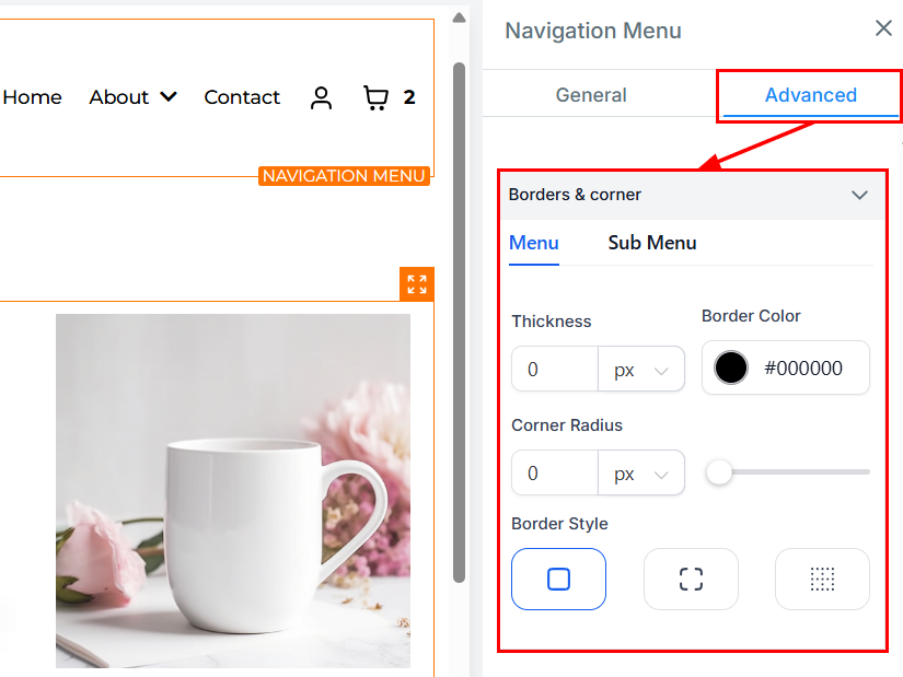
The Borders & Corner feature enables you to select the type of border you want for your content. Choose any of the available border styles, and define the settings for the border, including thickness, Color, and Radius.
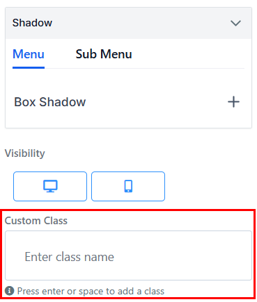
Shadow
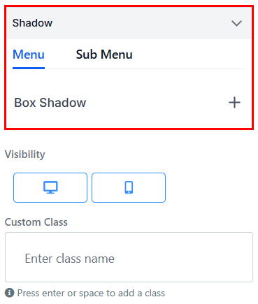
This feature allows you to add a shadow behind an element, creating a sense of depth and making the navigation menu stand out more prominently against the background.
Visibility
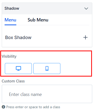
To determine where a particular edit option will be visible, you can select either mobile devices, desktops, or both by clicking on the relevant icon. This feature lets you choose where your edits will be visible and enables greater control of your content.
Custom Class
The Custom Class feature allows you to input your specific class into your content. Press Enter or space to add a class.
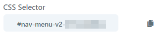
CSS Selector
When you’re completed with your navigation bar setup, you will have the option to copy the Custom CSS to use elsewhere. Simply click on the copy icon to the right of the reference code to copy the code.
By utilizing the Navigation Menu Element, you can create a sleek and user-friendly navigation experience for your visitors. With extensive customization options, you have full control over your menu’s appearance and functionality, ensuring it aligns perfectly with your brand and enhances user engagement.
Not a Funnelbud customer yet?
Try our all-in-one CRM for sales and marketing — free for 7 days, no commitment.