FAQ
FAQs, or Frequently Asked Questions, give customers the power to get the help they need quickly and easily. Customers can find what they are looking for without having to contact customer service. It not only provides a better customer experience but also increases their efficiency in finding helpful answers.
An FAQ Element is a great way to anticipate questions from your customer base by providing detailed, relevant info relating to your products and services. This way, customers know they can come to you directly when they have questions that need answering.
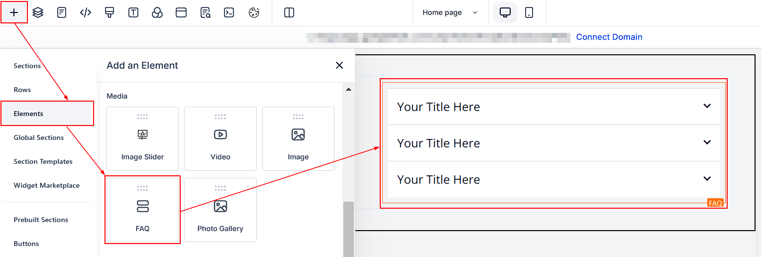
General Settings
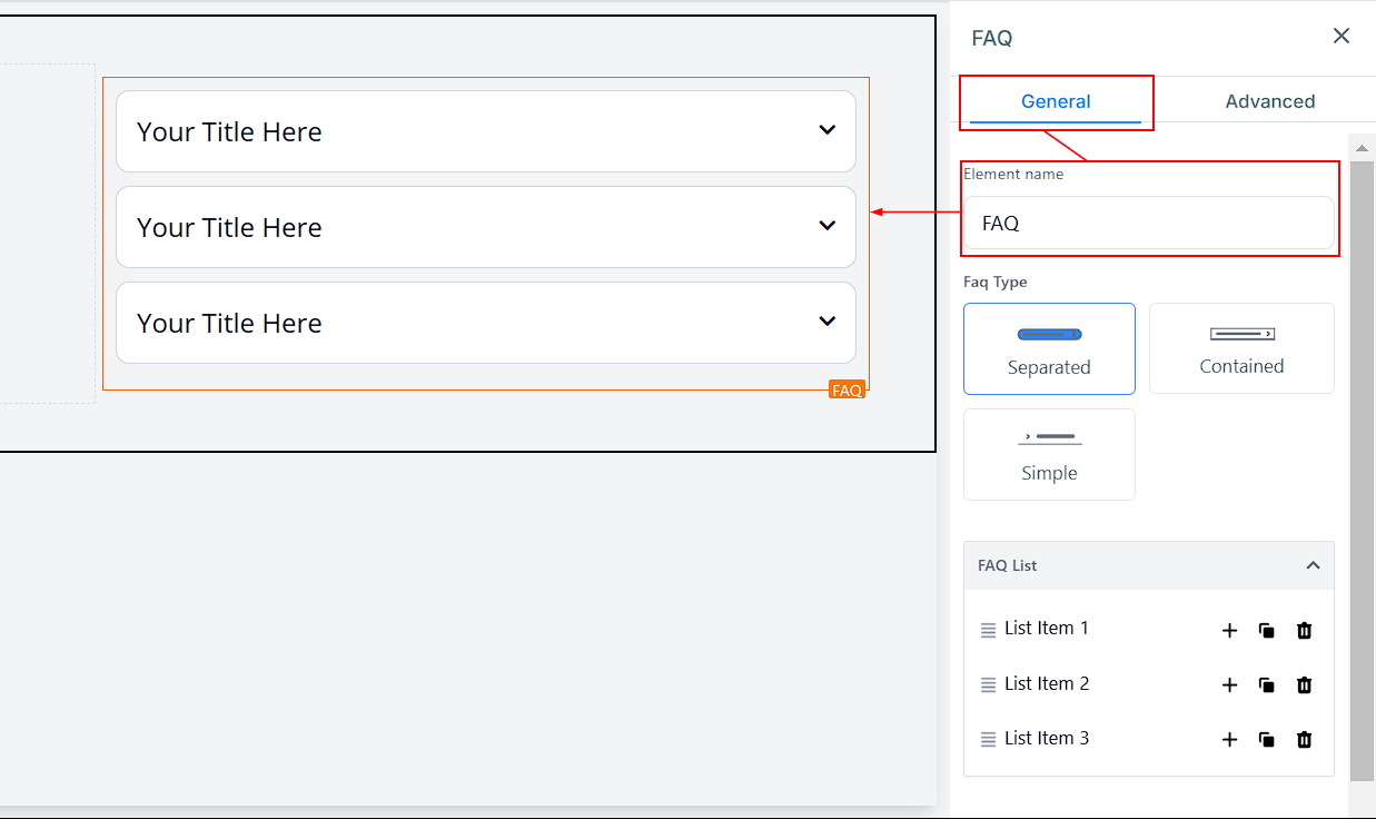
Element Name/Title
In the General Settings section, you will see the default name/title of the element you are working on. You can leave the name or change it for easier identification as you are building out your funnel page.
FAQ Type
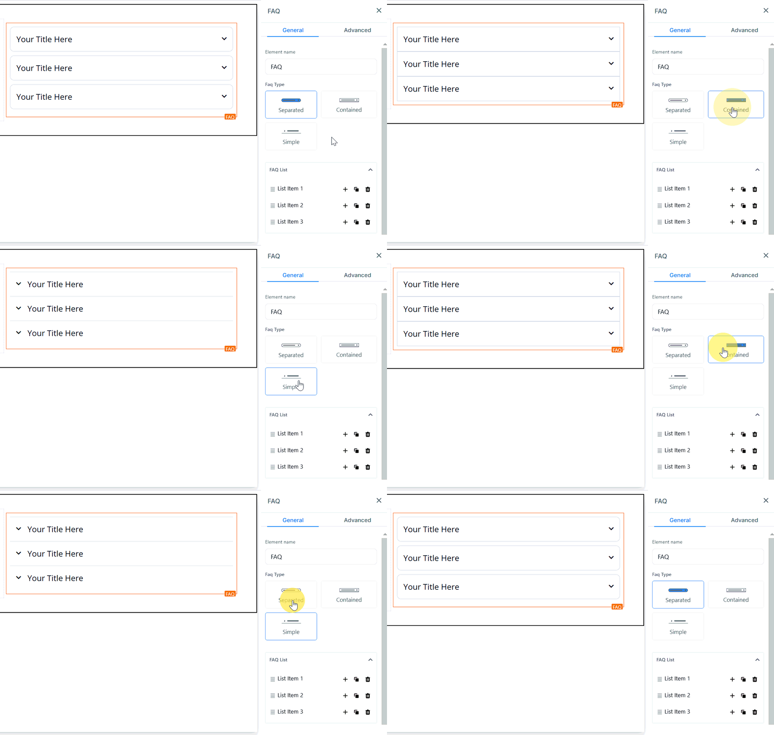
The FAQ Element allows you to create the look of your desired list. You have three options: Separate, Contained, and Simple Type.
- Separated: With the Separated Type, each entry is separated from one another with a drop-down button located on the right side of each list apart from its title.
- Contained: With the Contained Type, several entries are not necessarily separated from each other but include a drop-down button located on the right side, separate from its title.
- Simple type: And finally, with Simple Type, entries are once again clustered together, this time with a drop-down button located before the entries’ title on the left side.
FAQ List
Here, you will be able to edit each of the lists as you desire. When you click on the list you want to work with in the FAQ settings area, it drops down the list’s menu in the editor’s space for you to work with.
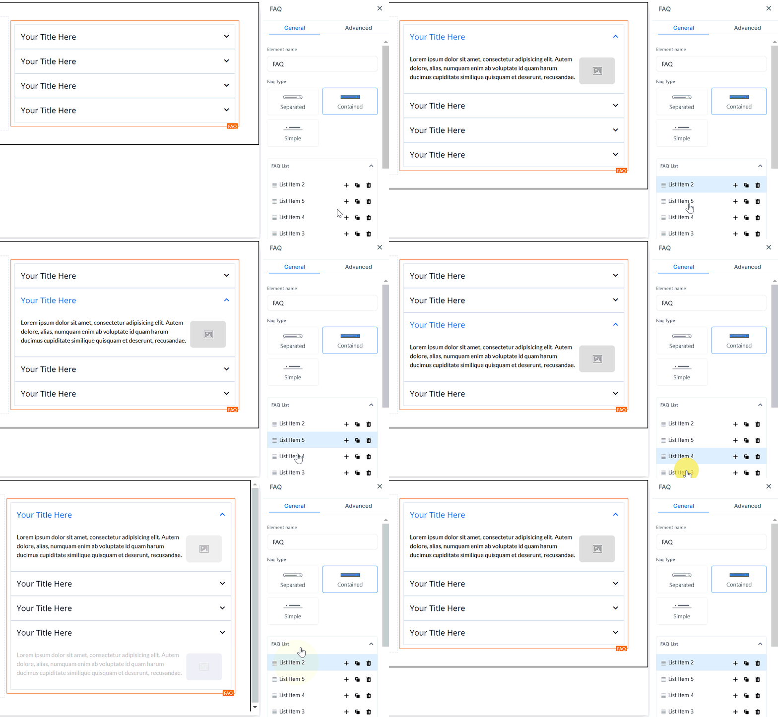
Below are the edits you can make;
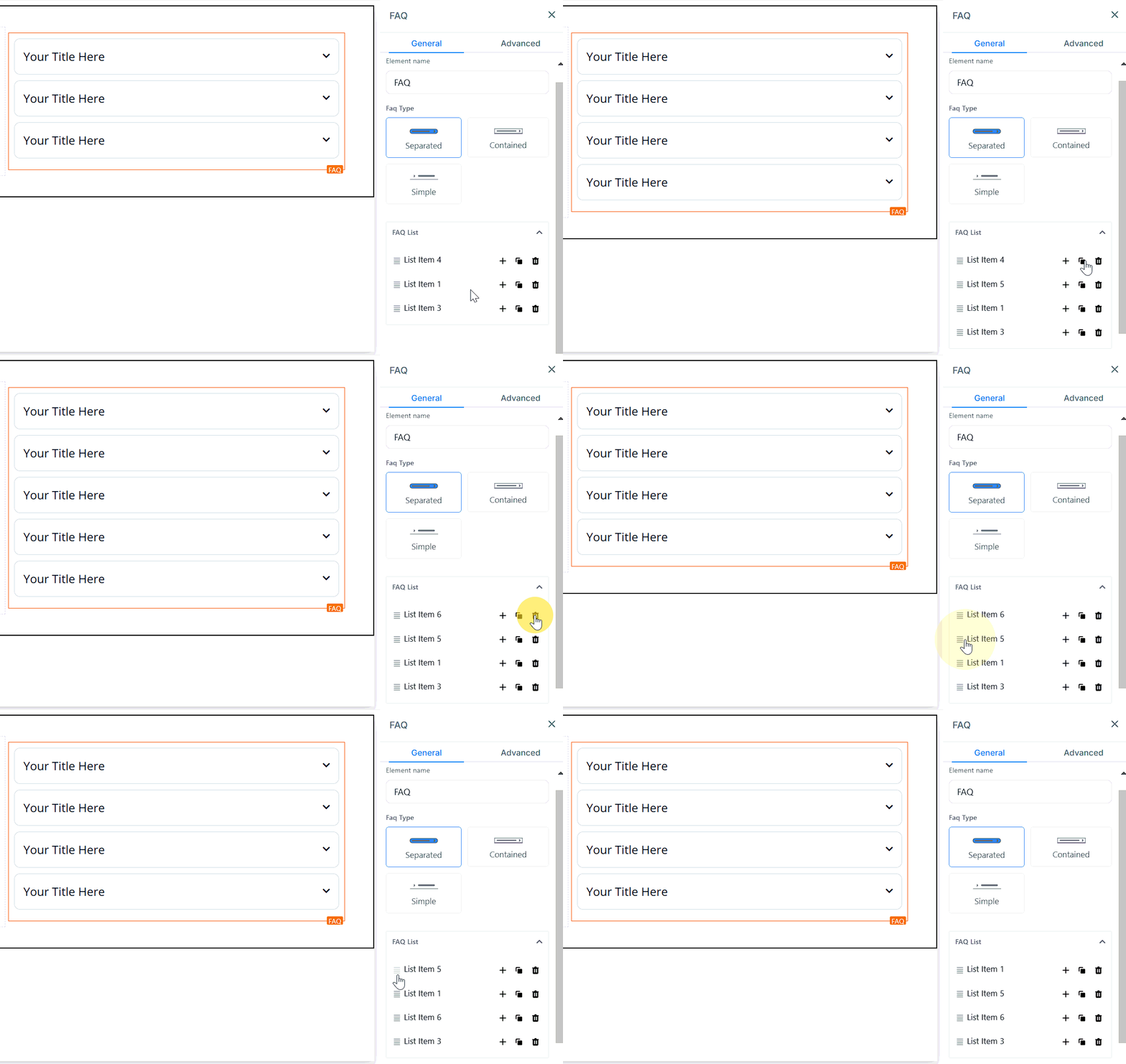
- Add New List: When you click on the ”+” button, it adds a new list for you.
- Duplicate Existing List: When you want to duplicate a list you have already created, click on the “Copy/Clone” button.
- Delete list: You can delete a list by clicking on the “delete” button. When you delete it, the list numbering doesn’t rearrange itself, although it doesn’t affect anything.
- Arrange List: If you want to re-arrange your list, click on the four (4) mini bars on the left side of the list you want to move, then drag and drop the list where you want.
Advanced Settings
Custom Options
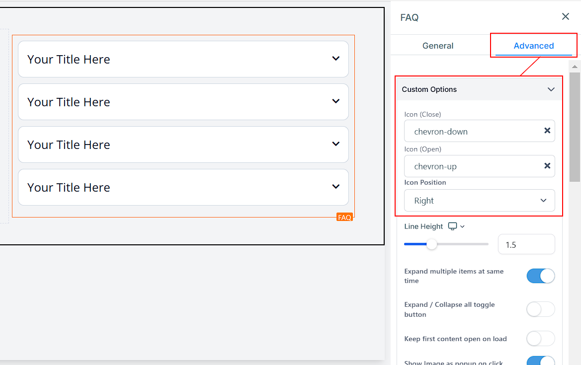
- Icon (Close): You can add an icon to your page by simply selecting from the available icons. If you have the desired icon in mind, you can type it into the search bar to narrow down the options. Here, the Icon used when the list’s drop-down menu is closed is “Chevron-down”.
- Icon (Open): You can add an icon to your page by simply selecting from the available icons. If you have the desired icon in mind, you can type it into the search bar to narrow down the options. Here, the Icon used when the list’s drop-down menu is Open is “Chevron-up”.
- Icon Position: You can position the icon on either the right or left side of the list. You can only make one choice for all lists.
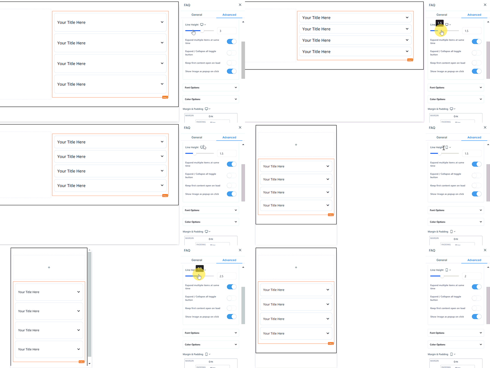
Line Height 1.5
You increase the height of the Element box by adjusting the size bar.
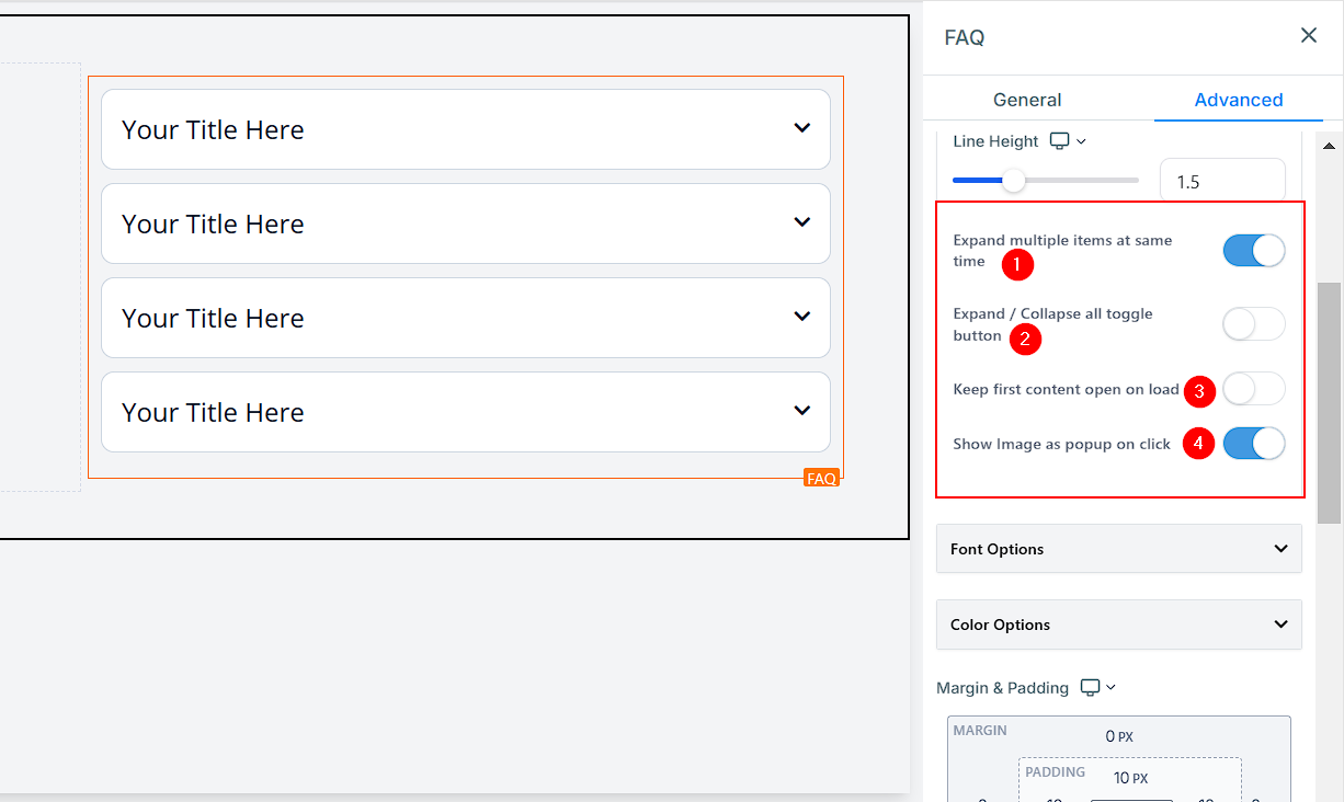
- Expand Multiple Items at the Same Time: When you toggle on this button, it allows your customers/visitors to drop down multiple menus at the same time. If you turn it off, it will only allow them to drop down one at a time; it collapses the previous menu when a new one is clicked on.
- Expand / Collapse all Toggle Button: When you toggle this button on, it adds an “Expand/Collapse All” button to the top left corner of the FAQ section. Once they click on the button, it drops down or collapses all list menus at once.
- Keep First Content Open on Load: When you toggle on this button, it drops down the first list menu in the FAQ by default when a customer/visitor loads the page.
- Show Image As Popup on Click: If you want images to pop up when clicked, simply toggle the Show Image As Popup on the Click button, creating an interactive and engaging experience for your visitors.
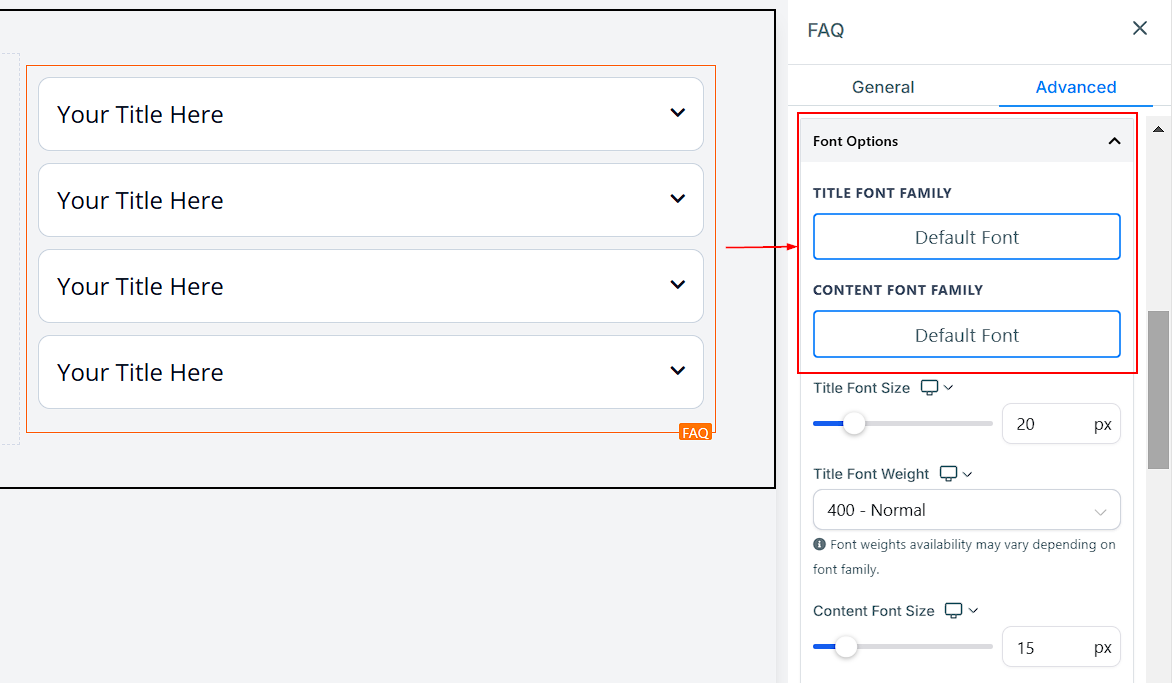
Font Options
- Title Font Family: Here, you can choose the font for the FAQ titles.
- Content Font Family: Select the font for the FAQ content.
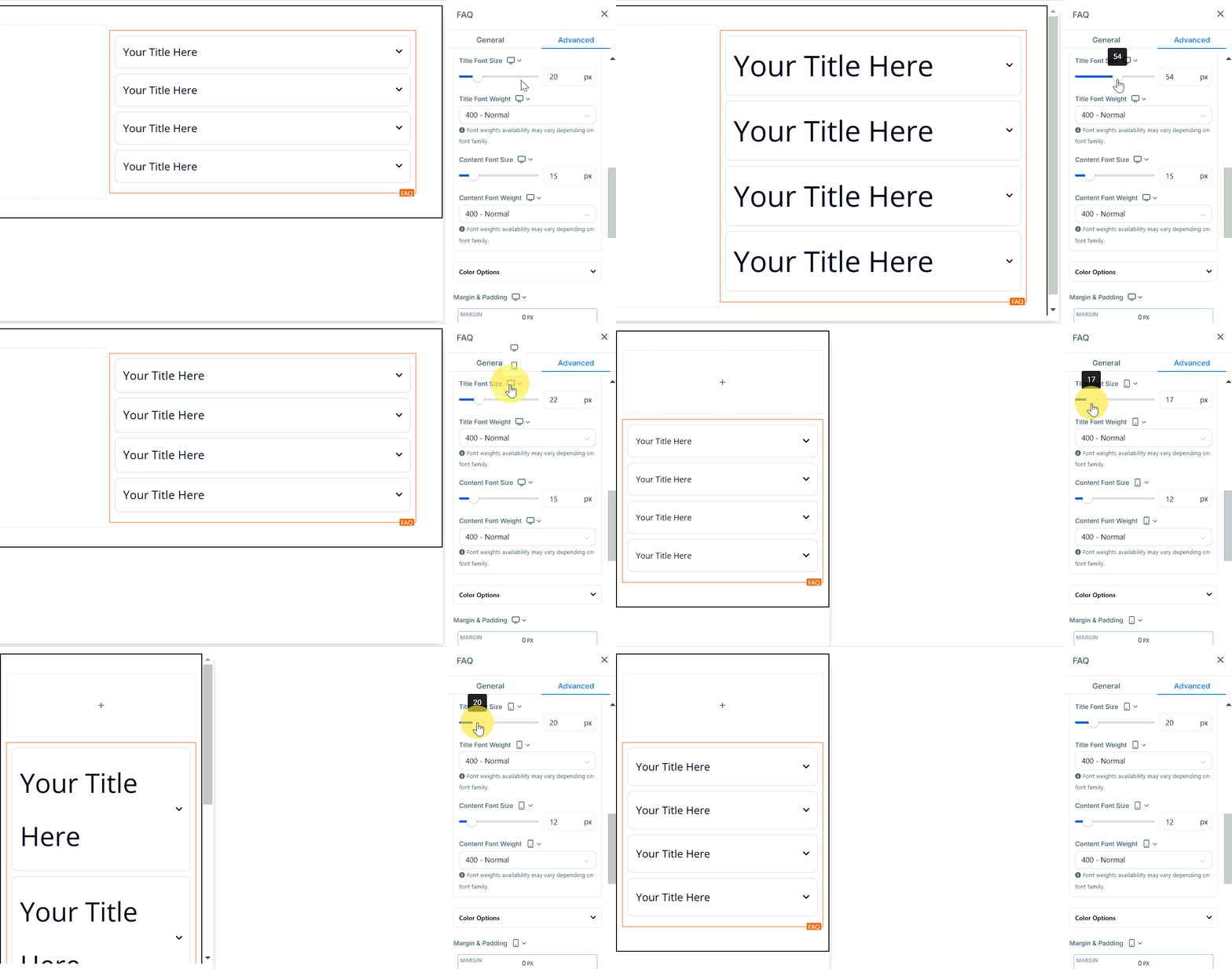
- Desktop & Mobile Title Font Size: Adjust the title font size for desktop and mobile devices.
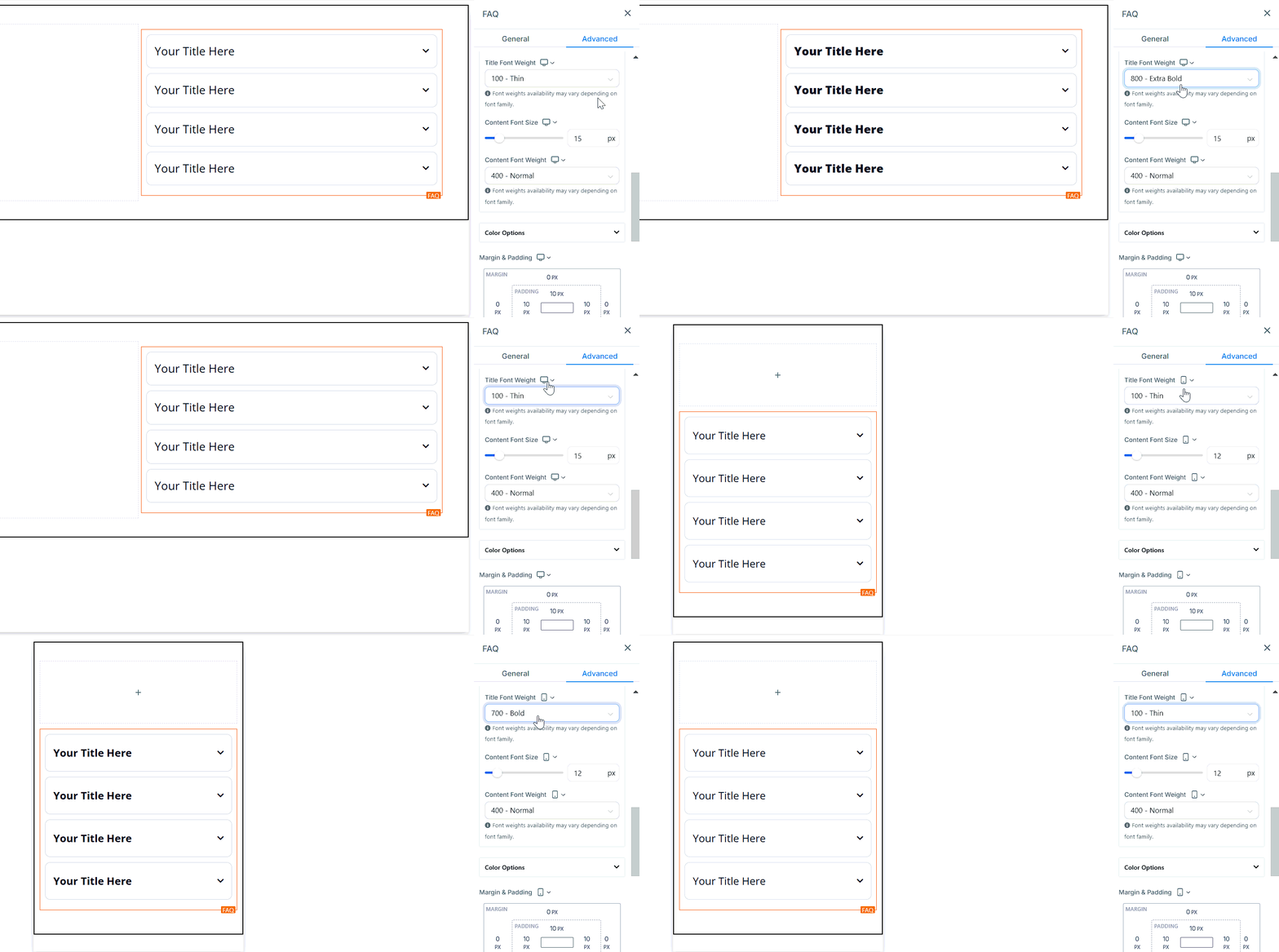
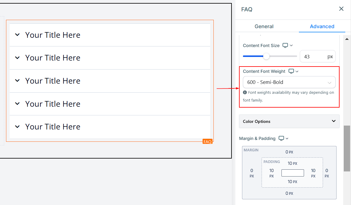
- Desktop & Mobile Title Font Weight: Customize the title font weight for desktop and mobile devices with this option.
- Desktop & Mobile Content Font Size: Adjust the content font size for desktop and mobile devices.
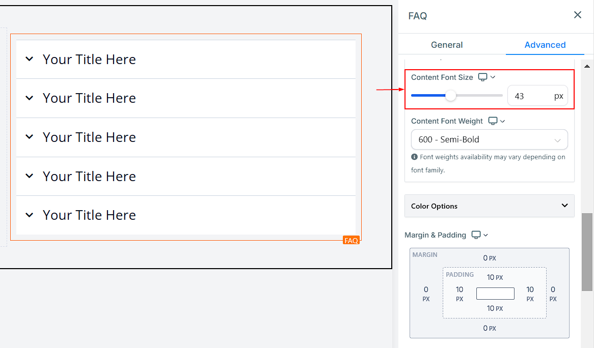
- Desktop & Mobile Content Font Weight: Customize the content font weight for desktop and mobile devices.
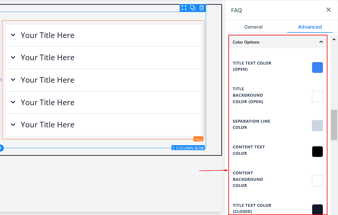
Color Options
- Title Text Color (Open): You can edit the color of your Title text, which changes the text when the menu drops down.
- Title Background Color (Open): You can also give your Title background a color that changes the background when the menu drops down.
- Separation Line Color: Here, you can select the color you want for the separation line. You can only choose one color for all lines.
- Content Text Color: You can edit the color of your content text here.
- Content Background Color: You can also edit the background color of your content here.
- Title Text Color (Closed): You can give your Title text a different color that changes when the drop-down menu collapses.
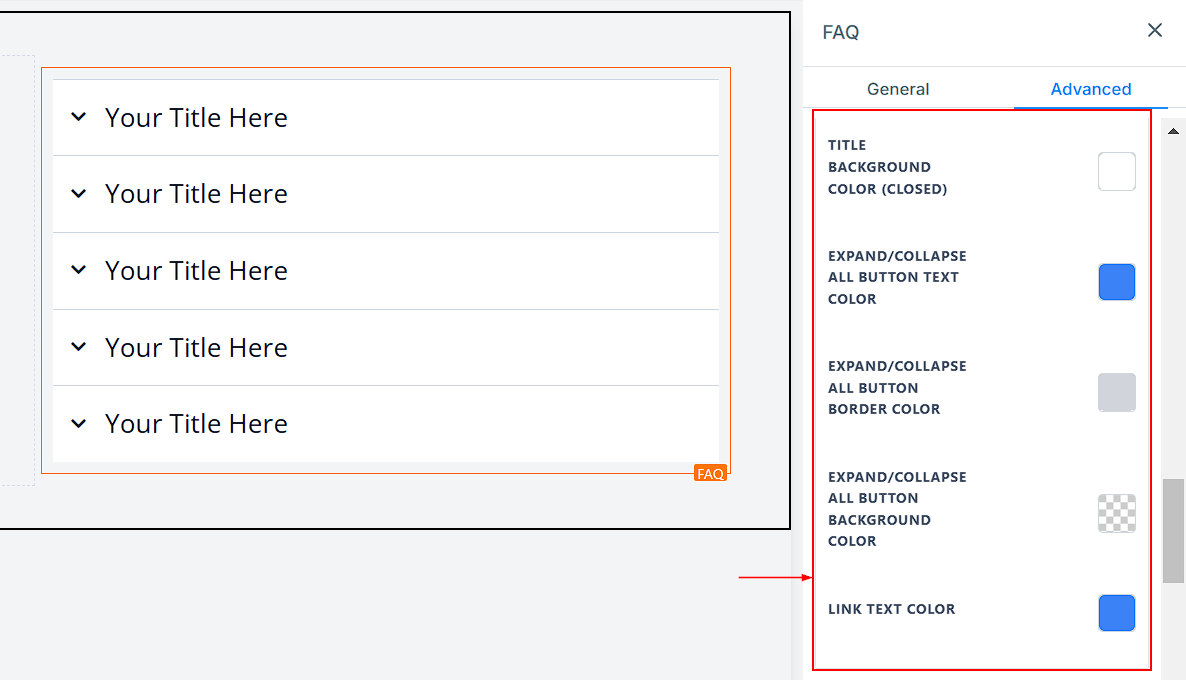
- Title Background Color (Closed): You can also give your Title background a different color that changes when the drop-down menu collapses.
- Expand/Collapse All Button Text Color: For the “Expand/Collapse All” button, you can edit the color here.
- Expand/Collapse All Button Border Color: You can also edit the border color of the “Expand/Collapse All” button.
- Expand/Collapse All Button Background Color: Here, you can edit the background color for the “Expand/Collapse All” button.
- Link Text Color: If you have a link added to this page, you can only edit the link color here
Spacing Option
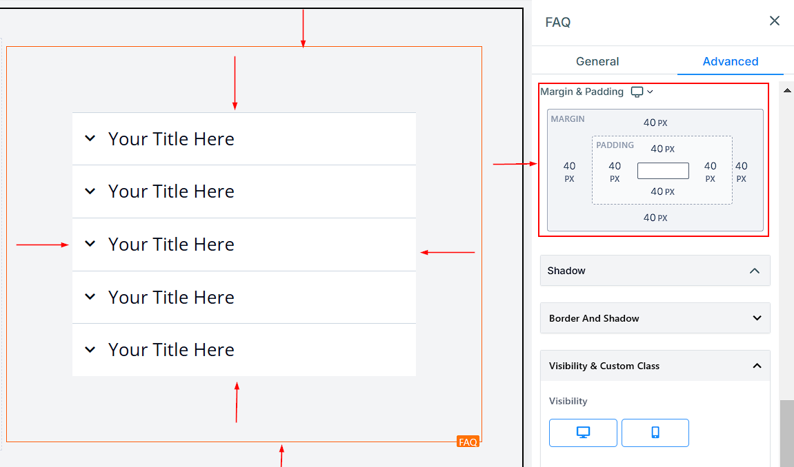
There are different spacing options available for adjusting your content. Depending on the Edit option you are working on, the settings will only apply to that option. For example, if you are editing a particular Row (the BLUE box), only the content in that Row will follow the command of what settings you make.
- Padding Left, Right, Top, and Bottom: These four (4) different toggle bars move the content to either the left, right, top, or bottom, depending on the toggle bar you click on.
- Margin Top and Bottom: You can adjust the top or bottom margin of your content by toggling its bars.
Shadow
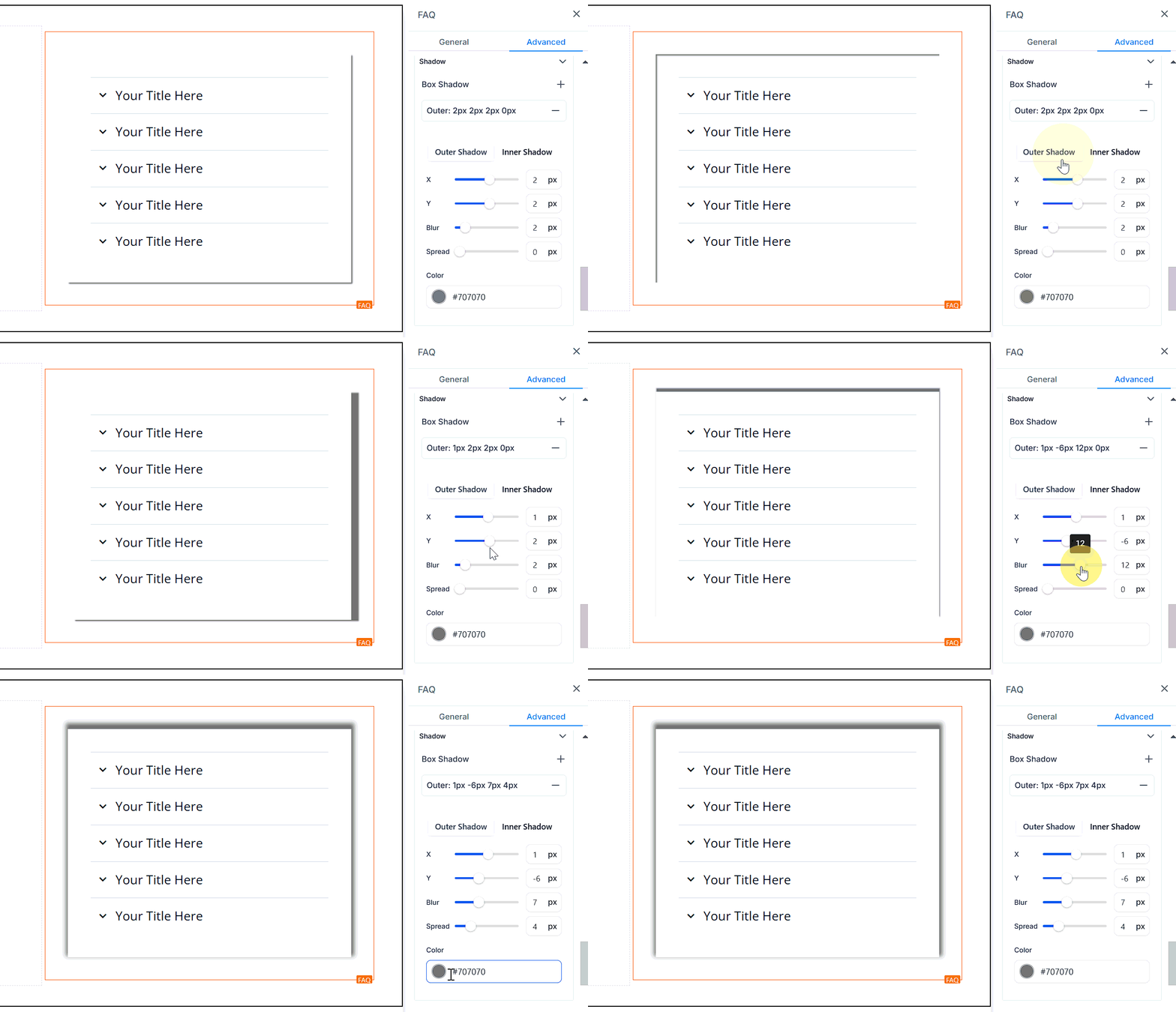
- Box Shadow: If you want to add depth to your web page content, you can use the Box Shadow feature. By selecting either the inner or drop shadow option, you can create a light or strong shadow effect around your content, giving your page a more dynamic appearance.
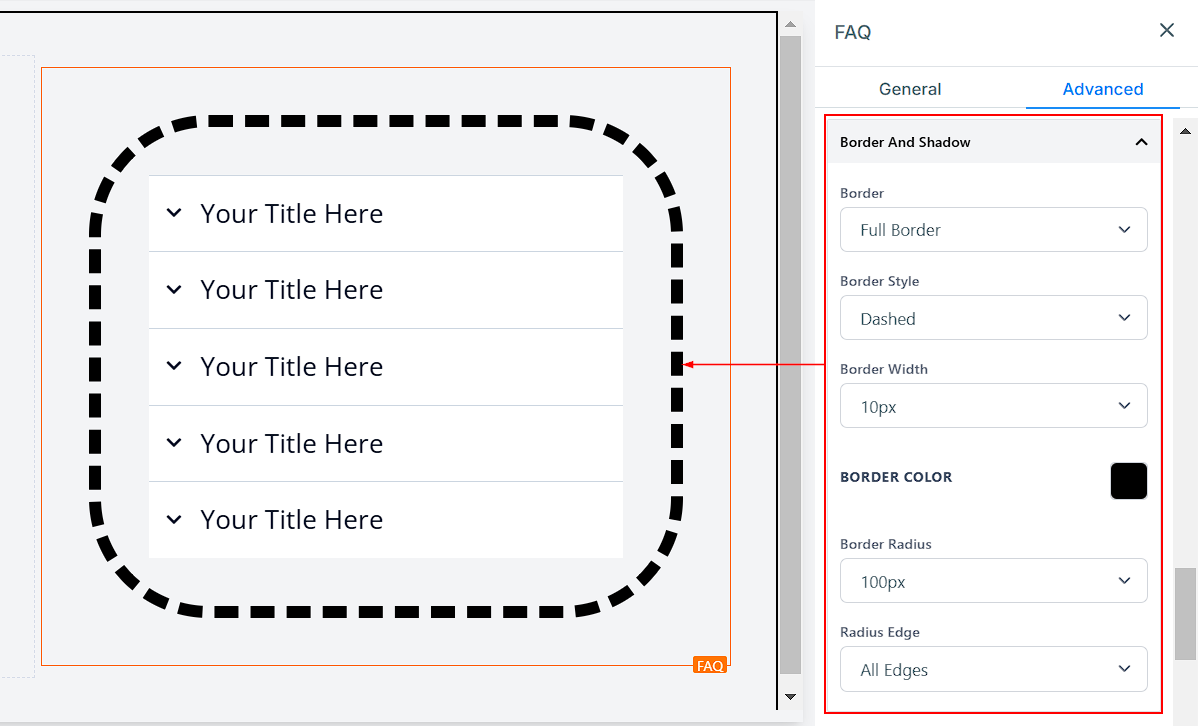
Border And Shadow
- Border Options: Border You can choose the type of border you want. Once you select any of the border types, the settings for the border pop up.
- Style: There are three (3) Different styles for your border: a solid, Dashed, or Dotted border.
- Width: When you increase the border width, it increases the thickness of the border.
- Color: To change the color of the border, click on this color icon.
- Radius: Adjusting the radius of your border curves the edges of the border; the higher the number you select, the curvier it becomes.
- Radius Edge: You can decide the corner of the border you want to curve, either all edges, Top only, or Bottom edge only.
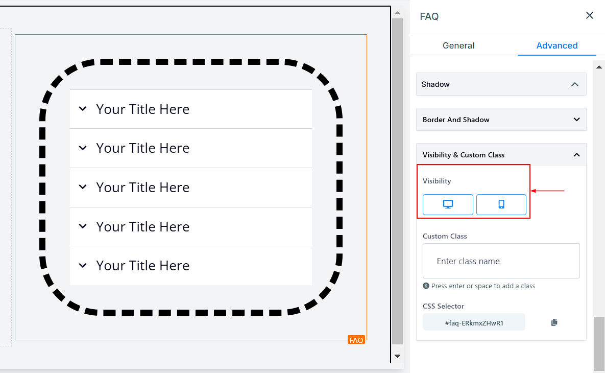
Visibility & Custom Class
- Visibility: You can decide if you want this particular Edit option to be visible on only mobile devices, desktops, or both by clicking on it to highlight the icon.
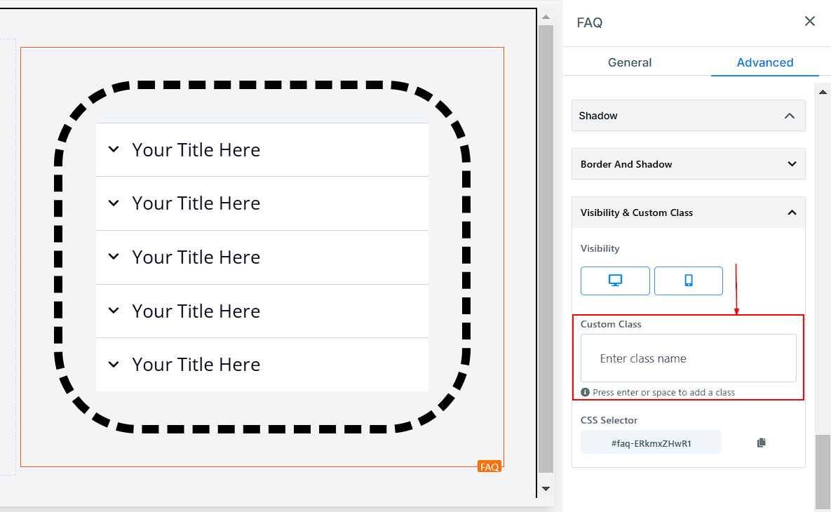
- Custom Class: You can add a Custom Class to your web page by inputting your desired class name into the dedicated field. This feature helps you to apply custom styles to specific elements of your web page by linking them to style definitions in a stylesheet.
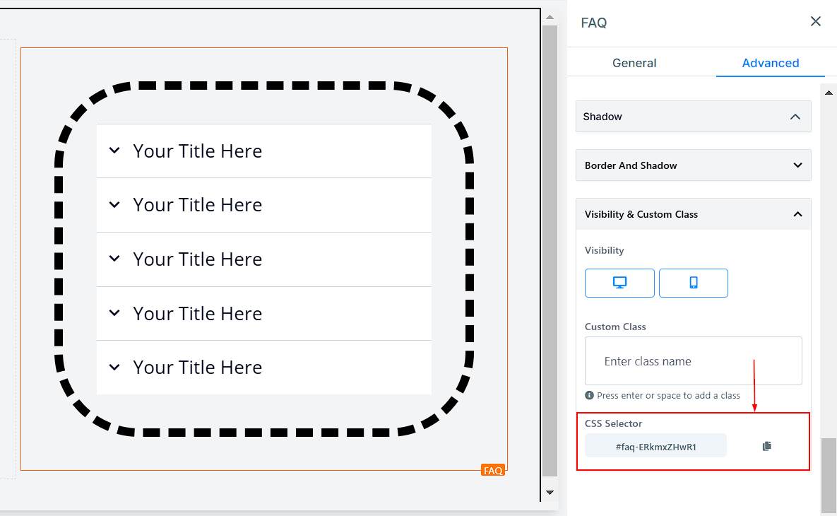
- CSS Selector: You can easily copy the Custom CSS code by clicking on the copy icon located on the right side of the reference code. This feature saves you time, making it quick and straightforward to replicate and implement your CSS Selector code across your web page.
The FAQ Element is a versatile tool for improving customer experience by providing quick, accessible answers to common questions. By customizing its layout, design, and functionality, you can create a seamless and engaging experience for your visitors.
Not a Funnelbud customer yet?
Try our all-in-one CRM for sales and marketing — free for 7 days, no commitment.