Button
Buttons are essential in increasing functionality and grabbing leads’ attention. So, let’s dive into the details to make your button stand out. To start, drag the button element into place by selecting it from the elements menu.
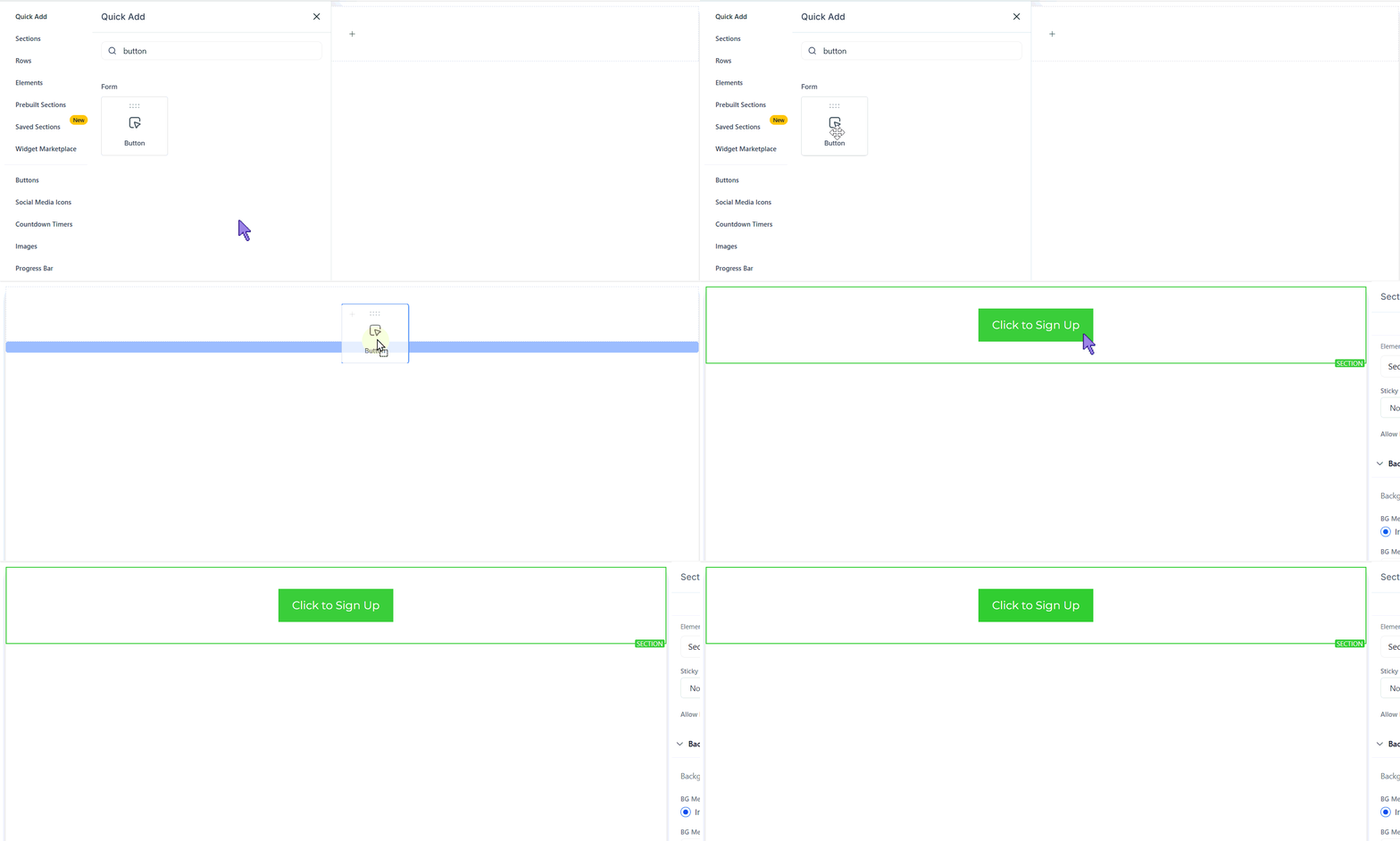
Once placed, you can customize its appearance and functionality to match your design goals by clicking the element to open its settings to the right. The settings will be separated into three categories.
General Settings
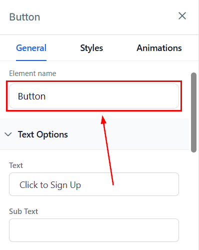
Element Name
The editing toolbar for the selected element appears on the left side of the editor. You can rename the default name or title displayed at the top of the screen for ease of navigation as you create your funnel page.
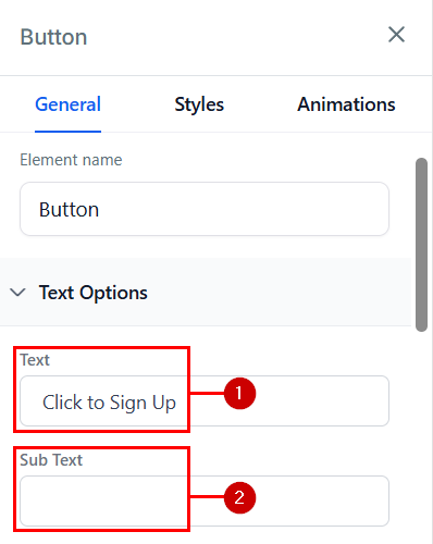
Text Options
- Text: This is where you can edit the text in your button.
- Subtext: If you like to add a subtext to your button, type it here.
Typography
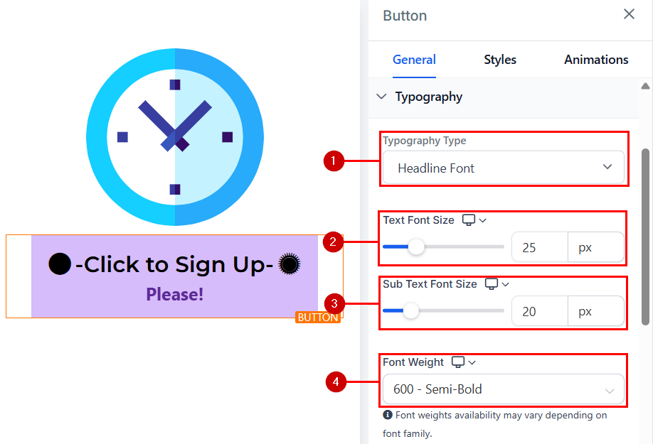
Here you can edit the font of the button’s content. The available options will be:
- Type: This lets you choose a new typography font from the drop-down menu.
- Text Font Size: You can adjust the font size of the text simply by adjusting the size bars.
- Sub-Text Font Size: You can adjust the font sizes of the sub-text’s content with this option.
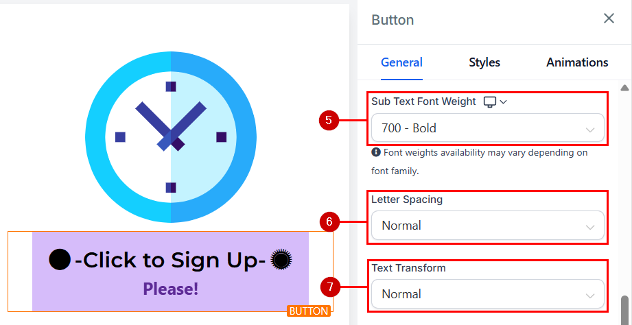
- Font Weight: This setting allows you to change the thickness of your button text. Choose from options like light, regular, bold, or extra bold to match the tone and style of your design.
- Sub-Text Font Weight: Similar to the main text, you can adjust the thickness of your sub-text. This helps you create a clear hierarchy between the main button text and any additional details.
- Letter Spacing: Decide how wide apart you want the letters in your button to be by clicking on this option.
- Text Transform: Change the text to uppercase, lowercase, or capitalize each word.
Button Actions
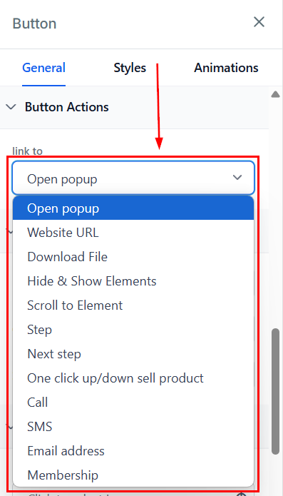
You can select from the options where you would like to link this particular button. Your options are:
- Open Popup: A preset popup will be displayed.
- Website URL: Contacts will be redirected to the configured website. You can also choose whether the URL should open in a new tab.
- Download File: Upload or select a file from your media library to be downloaded upon clicking.
- Hide Element: Specify the elements that should be hidden when the image is selected.
- Show Element: Specify the elements to be displayed when the image is selected.
- Scroll to Element: Select the element to which the page should scroll when the image is selected.
- Step: Choose the step the image should display when clicked.
- Next Step: Redirects to the next step in the funnel or on the website.
- Call: Initiates a call to the selected number when the image is clicked.
- SMS: Initiates an SMS message to the configured number.
- Email Address: Initiates an email to the configured address.
- Memberships: Redirects your contacts to your client portal, allowing them to join your courses or communities.
Color Options
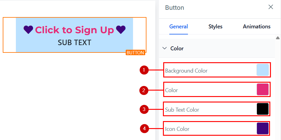
- Background Color: Change the background color of your button with this option.
- Color: You can adjust the text color in the button here. For example, the “Click to Sign Up” text
- Sub-Text Color: When you add a sub-text to your button, you can only adjust the color in the button here.
- Icon Color: Use this option to adjust the color of the leading and trailing icon.
Icon
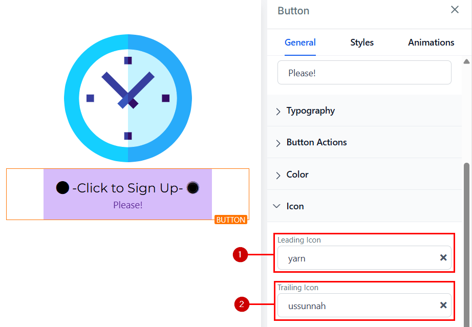
Add an icon to your button by selecting from the available options or using the search bar to find the specific icon you want.
- Leading Icon: This will place an icon before your text on your button.
- Trailing Icon: When you add an icon in this section, it will be positioned after the text in the button.
Styles
Button Appearance
Use these options to modify the buttons’ direct appearance.
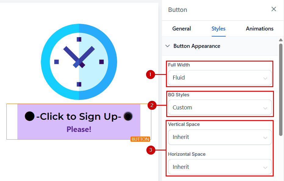
- Full Width: You can decide to make the button the full size of the element box or just as fluid.
- BG Styles: You can decide to keep the background of your button or just remove it so it’s just the text that will appear.
- Vertical and Horizontal Spaces: You can increase or decrease the height and width of the button in these spaces.
Spacing Option
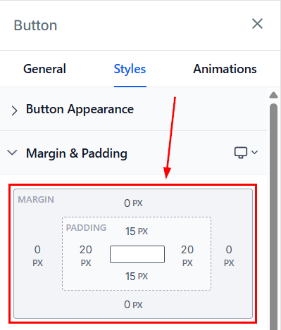
There are different spacing options available for adjusting your button. Depending on the Edit option you are working on, the settings will only apply to that option.
- Padding: These four toggle bars move the content to either the left, right, top, or bottom, depending on the toggle bar you click on.
- Margin Top and Bottom: You can adjust the top or bottom margin of your content by toggling its bars.
Border Options
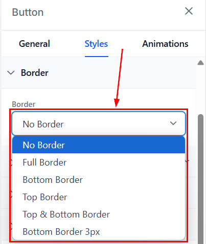
- Border: You can choose the type of border you want. Once you select any of the border types, the settings for the border pop up.
- Style: There are three (3) Different styles for your border, It could be a solid, Dashed, or Dotted border.
- Width: When you increase the border width, it increases the thickness of the border.
- Color: To change the color of the border, click on this color icon.
- Radius: Adjusting the radius of your border curves the edges of the border, the higher the number you select, the curvier it becomes.
- Radius Edge: You can decide the corner of the border you want to curve, either all edges, Top only or bottom edge only.
Button Align
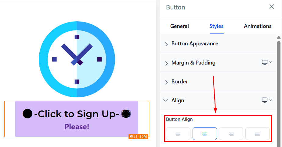
This setting lets you align your button text and icons to the left, center, or right. Adjust it to ensure your button looks perfectly positioned on both desktop and mobile views.
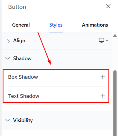
Shadow
- Box Shadow: Add a shadow effect to your button to make it pop.
- Text Shadow: If you want your text/content to have a shadow, simply select how strong or light you want the shadow to be.
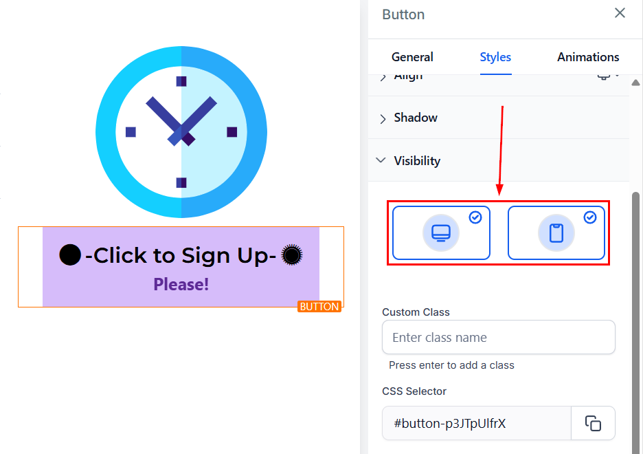
Visibility
You can modify the button’s visibility for the mobile and desktop versions of your pages.
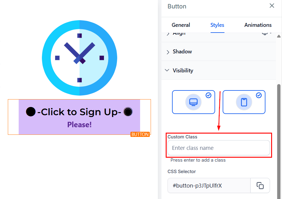
Custom Class
Add a Custom Class by typing a desired class name in the Custom Class field.
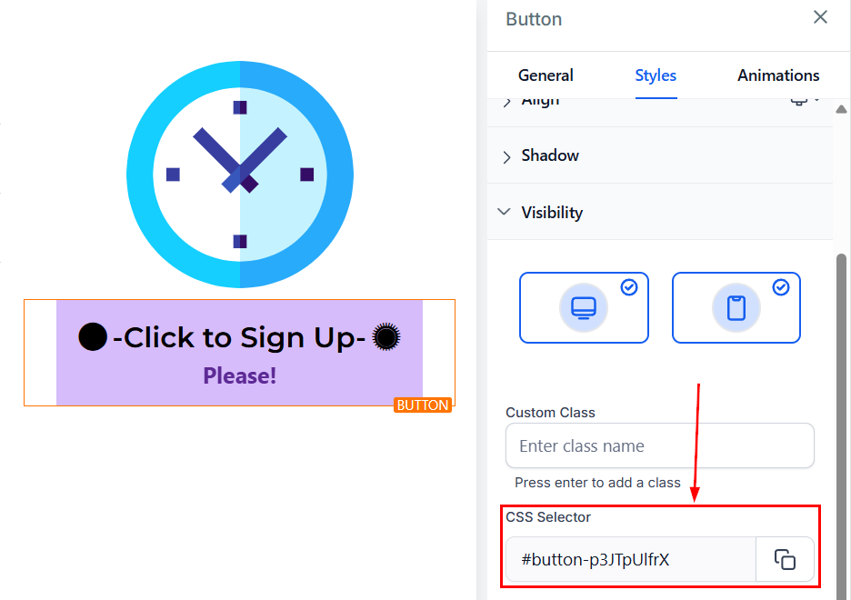
CSS Selector
Click the copy icon on the right side of the reference number you want to copy to copy the CSS Selector.
Animations Settings
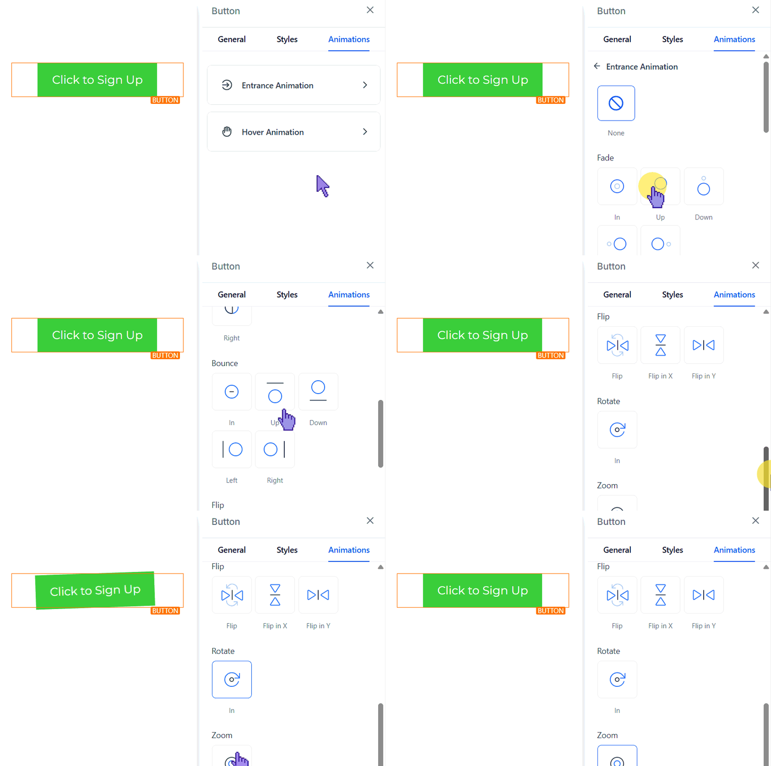
Entrance Animation
Choose an animation effect for when the button first appears on the page, such as fade-in, slide-up, and much more.
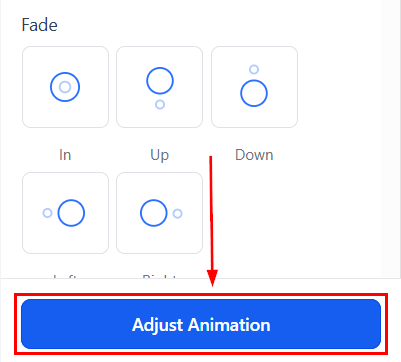
To customize the animation details, click Adjust Animation. This lets you modify the scale, duration, delay, and easing motion of your animation.
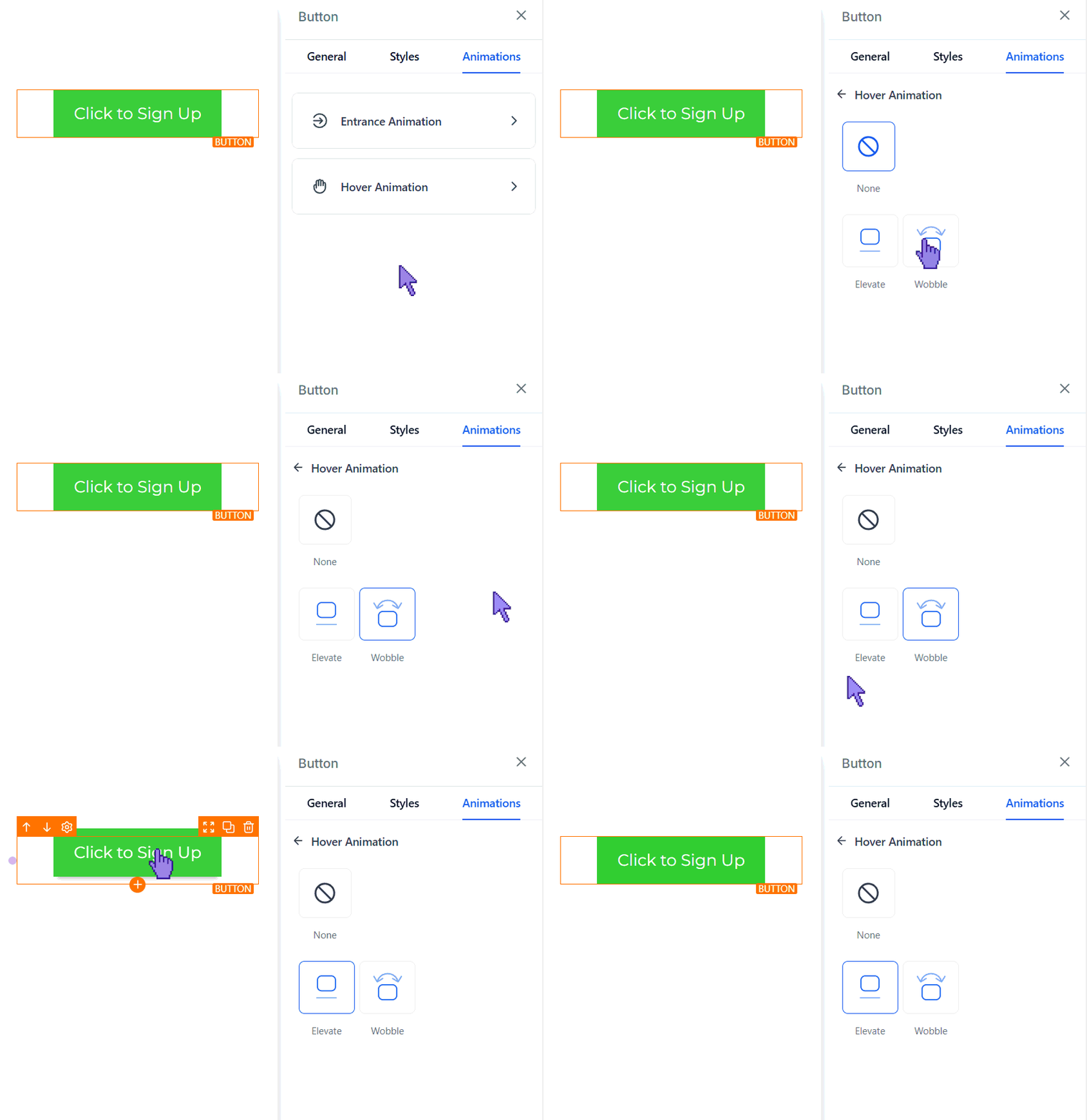
Hover Animation
Add an effect that triggers when users hover over the button.
And that’s it! With these steps, you can easily add and customize a button that not only looks great but also drives action.
Not a Funnelbud customer yet?
Try our all-in-one CRM for sales and marketing — free for 7 days, no commitment.